23 August
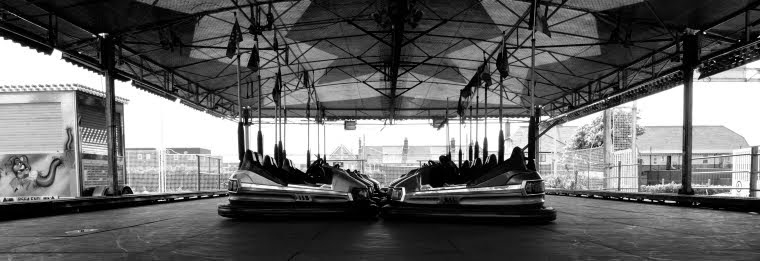
For my theme, my first idea was to show life in a zoo park from two different perspectives: outsiders looking in, and animals looking out. The idea for this has come from two different sources: firstly because I want to try out my D810 plus new lenses on animals (it has only been used for street photography so far!) and particularly to test whether the ability to handle dynamic range i.e. black creatures in midday sun, is better than the D5000 I was previously using (and for reasons of time I need to multitask!), and secondly I'm intrigued by the image taken by Count de Montizon in 1852 in London of the Hippopotamus at the Zoological Gardens, Regents Park, see Bate, 2013, p24 (which I first wrote about during Digital Photographic Practice - see here for a summary).
Bate uses the image to demonstrate the that there may be different points of view within a photograph. In this instance, we know from our general knowledge that it is extremely likely that the hippo is the one in the cage, however, looking at the photograph, the onlookers appear to be in the cage. There is a realism that we know to be true, and then there is doubt about where the viewer is placed, and indeed where the hippo is placed in relation to the viewer (Bate, 2013, pp37-40). It asks the question whether humans been imprisoned by nature.
So, I'm going try to take 5-7 pairs of photographs showing the perspective of the animal, or the viewer inside the cage, looking out, and the perspective of onlookers looking in, to produce representations of the juxtapositions of these two worlds that are forced to co-exist.
I don't know yet whether these will be colour or black and white, or square or rectangle format. Being right-brained, I will decide later! A lot will depend on the lighting, background detail, what stands out. I suspect the outcome will be colour and rectangle landscapes, but we will see.
24 August
So I tried to put my idea into practice at Drusillas and realised very quickly that I would end up with 5-7 photographs that all looked the same and which would not demonstrate any great technical or creative ability...so idea abandoned.
But, on a spontaneous trip to Worthing on the way back from Drusillas, another idea came to mind. I could try to show two different perspectives on English life - "This is England or is it?", with one perspective being themes that are quintessentially English and the contradiction being themes whereby due to the framing (e.g. a palm tree against a hotel) could be from somewhere that is not England. Back to Worthing tomorrow to try it out! Themes could include (and not necessarily be tied or limited to this):
- Ethnic diversity
- Food
- Plants
- Buildings
- Restaurants
- Street signs in different languages or the London tube map / Hong Kong tube map in Newport Court in London WC2
- Customs e.g. tea and scones / drinking starbucks coffee
7 September 2014
I missed the boat on the last idea. The season for people eating ice creams on the pier is really over. I love the theme of English summer and Englishness, so I will save this for another occasion. But, fortunately, another idea has come to mind! Through my participation in the Bleeding London project, I've got to know my local area, Feltham, very well. And I've noticed that there are two very distinct sides of the same story. The area is typically run down, lacking investment, rough, dilapidated and so on, but there are pockets of more attractive qualities, which if photographed selectively and shown out of context, would present a very different story and also present a distinct series of contrasts:
- confinement vs space (Young Offenders vs the open space in front of it)
- dilapidation vs regeneration (building opposite Macdonalds vs the new academy being built)
- struggling economy vs booming economy (empty restaurant vs full (and happy) kebab shop
- neglected front garden vs elaborately tended front garden (multiple gardens to chose from full of junk vs the lovely one with the amazing happy hedges in Cedar Road, which although awful just makes me smile)! (see photo below taken earlier this year - to be reshot though)
- rowdiness vs peace (outside the Weatherspoon Pub vs the cemetery)
- crowded living space vs beautiful house (blocks of flats with railings vs original beamed house on Ashford Road)
- angry scary people vs happy people (people at bus stop vs people exercising dogs)
 |
| Cedar Road |
These images are most likely to be viewed in an academic context only, so by my tutor, the assessors, other students, and also members of Crossing Lines. I think I will be unlikely to show these images to people in a social context or to print and hang them on my own walls, although with any photos I take, there is always a chance that they will be entered into an exhibition!
Am I taking any risks with this? In a word, yes. Walking through Feltham with a DLSR is always a risk, and especially with a D810 (it is insured!); taking the pair of street photographs of people might be tricky....might get punched.... ;-)
15 September 2014
So my thoughts are evolving - along the lines of the above, I'm thinking of looking for contrasts that I can shoot by being in the same position and pivoting 180 degrees - and also finding resonance and contrast within each pair in the process:
- weapons bin / cash machine
- dilapidated building / new look shop
- pub / church or cemetery
- young offenders / open space
- garden opposite / garden with hedges
In the end, I went with the option described on 7 September 2014 above, but with the colour option only. I decided it was too cliched to present the negative concepts in black and white. I wanted to present the opposite views with resonances also and colour would help significantly with that.
The objective of this exercise was really to see if by careful framing, I could produce a convincing series of the better qualities of Feltham. This illustrates the point made by Susan Sontag (2003) about a photograph:
"It is always the image that someone chose; to photograph is to frame, and to frame is to exclude".
What I would be doing is, as photographers do with every shot, presenting a selective and subjective view. Hopefully by looking at each set, the viewer would be able to form an opinion of the area dictated by choices I made. I will comment on whether this is successful in the reflections post.
I tried the 180 degrees option described on 15 September 2014, but found very quickly that this wouldn't work with the sun shining in my face...and I didn't have the time flexibility to make two trips to each point. Unfortunately, I didn't get my hedges - the sun was in the wrong place at the wrong time, plus there were cars parked outside the house each time I went to have a look :(. But I did get seven sets of contrasts:
- weapons / cash machine
- dilapidated building / new building
- end of life (cemetery) / new life (conkers)
- bust business / thriving business
- abandoned toy / rescued toy
- cramped living (flats) / detached living ground (house)
- confined (young offenders) / open (green space)
My approach to editing and processing is very simple. For a start, I did not have to make many choices, all the good light photographs were deliberately shot, and the four with flat light (pairs B and E) were in fact chosen from a bank of Bleeding London photographs taken on the previous day that were better in terms of concept and composition than two of the pairs intended. All were shot with Nikon D810 body and a Nikon 24-70mm f/2.8G lens. Processing took place in ViewNX 2 and followed a simple routine: straighten, crop, exposure adjustment, shadow protection adjustment, (in same cases picture control reset to Landscape) contrast, colour boost and sharpening. As the lens is new there were no blemishes to remove. That's all I do. I'm capable of a little more in Elements, but for this piece of work, there really was no need.
All pictures submitted are in square format. This is a personal preference from a creative perspective, which I can't really explain. I just really like square images! Matt Stuart told me that I need to be able to answer this question if I'm going to continue to use square format, so it might be because I like pictures that are straight to the point and which exclude unnecessary information. But I can't be certain of that theory! In some cases, I prefer rectangle pictures (landscape), so it just depends. I tend to avoid vertical rectangles if I can. In any case, for this submission, square format seemed to work well in terms of composition, so I will be interested to see what the feedback is. In addition, I think square format works for viewing on personal devices.
These photographs were mostly taken for the purposes of the assignment, with the exception of pairs B and E, as previously mentioned. It is likely that they will only be seen by my tutor, fellow students and the assessors, plus the Crossing Lines group that I'm going to show them to (on account of their interest in urban conditions). Pairs B and E are online on the Bleeding London submission site, and hopefully will be included in the Bleeding London exhibition (if they are selected).
See submission for the final results.
References
- Bate, D. (2013), Photography The Key Concepts, London: Bloomsbury Academic
- Sontag, S. (2003), Regarding the Pain of Others, London: Penguin Group
- Martin Parr (2014) [online] available from http://www.martinparr.com/ [accessed 24 August 2014]
- Paul Russell (2014) [online] available from http://www.paulrussell.info/ [accessed 25 August 2014]
No comments:
Post a Comment