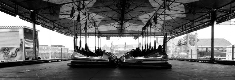

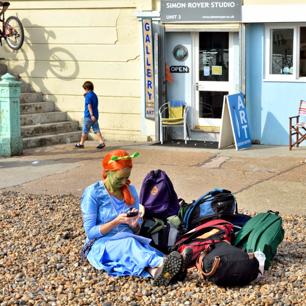
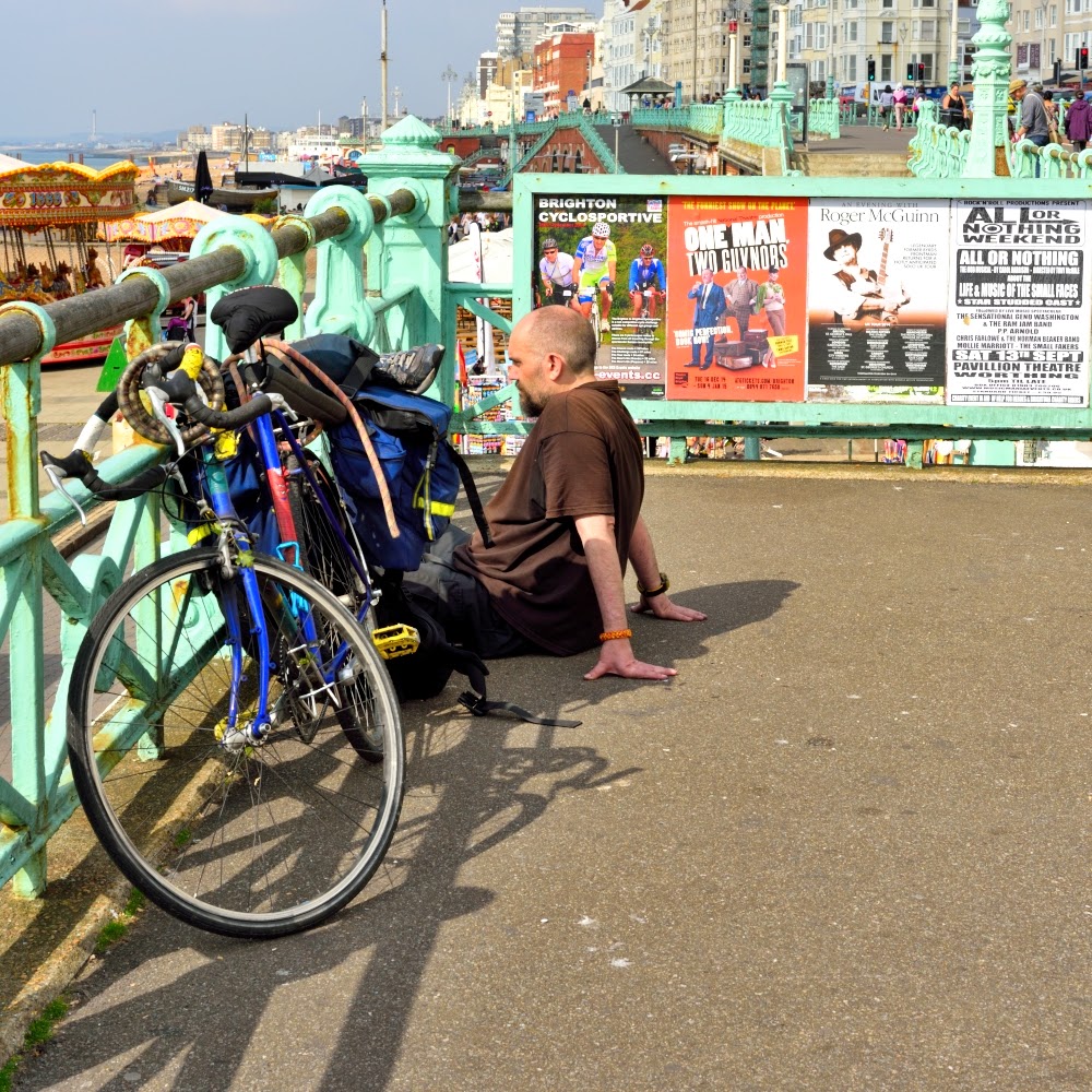
30 shots in colour:


30 shots in black and white:


Which do I prefer? Overall I prefer street photography in colour, including for my own pictures, and especially seaside scenes; I think you get a much better sense of the atmosphere and light that is so "Brighton" with colour. All the images that I converted to monochrome looked better in colour than they do in black and white, with the exception of the M&M image (which bizarrely is the image that is closest to my "In-Public" take on street photography described in my previous post), the shot with the coffee barrel and the chap putting on sun cream pulling a face (better cropped in, colour and under-exposed!). I also like the picture of the old lady looking at a gentleman's piercings, but this one could have been composed better. As I noted in my previous post, the black and white adds a more documentary feel, and I think the exclusion of colour in this particular setting takes away the "joy" of Brighton. Clearly, the images with better shadows are more successful in black and white than the flatter images.
Not all of these images meet my criteria of street photography previously described, but some of them do. But, as a collective piece of work, they document a day in the life of Brighton with its diversity of residents and visitors! And this is the kind of photography I love doing - right-brained, fun, spontaneous! And looking at these, if I could learn to slow down, look and frame the shots better, I would get better results.
No comments:
Post a Comment