Waiting for Summer

Waiting for Summer

Sunday 28 September 2014

Part One - Photograph as document: Project Five - The manipulated image: Exercise 2 - Digital technology and truth

The exercise requires us to consider whether digital technology changes how we see photography as truth and to  consider both sides of the argument making notes in our learning log.

To answer this question, you need to consider the purpose of the digital technology being used.  For my purposes, it enables me to straighten, repair exposure misjudgments, add contrast, boost colour, sharpen and crop.  I don't consider that it makes the photograph any less truthful, as all my photography is unstaged and without interference.  The closest I'll get to rearranging a scene is to kick away some rubbish or remove a leaf that might be blocking a view to a bug.  The truth from my perspective is defined by the framing, not by the technology.

But, there are other photographers, e.g. Darius Kilmczak, whose work is entirely fictional moreover surreal.  Sure, each component part of a photograph is captured truthfully, but the assembly and construction makes the result a fabrication.

Wells (2009) argues that the move towards dislocated moments in documentary photography provides more artistic reference, which may well be accurate, however, I don't see this as a step away from the truth; it is simply the truth at that moment in time from that photographer's perspective.  Of course, photography will always be subjective, as elements are excluded from the frame, but that is true of anyone reporting a scene or an account of an event, even in written or oral forms, there will be elements that are excluded.  In my view, this does not make them untruthful; more that they are snapshots of the truth.

Wells (2009) goes on to describe how digital technology enables fabricated images to be constructed.  The medium of this work is still photography, but the move is away from documentary/reportage towards pure art.  In my view this is still acceptable, but it's not about truth, it's more creative than that; just don't call it documentary/photojournalism or reportage!

References:

Part One - Photograph as document: Photograph as document: Project Five - The manipulated image: Exercise 1 - composite image

Just to be clear about things, image manipulation beyond a few tweaks to colours/exposure, is beyond the bottom of the list of what I want to do.  I appreciate images by other people, e.g. Darius Klimczak has an amazing surrealist mind, and I enjoy looking at his images, but this is not an avenue I want to pursue.  In fact, it couldn't be further from what I'm interested in.  So, I'm afraid to say that my approach to this exercise was just to get through it in the hope that I won't have to repeat it in the future.

I chose two images to compile:


I then selected the rabbit's head using the lasso tool, cut and paste it into the background image (into a box, moved the box into position on the draining board, and then shrunk it so that the writing was still visible:


 Websites:

Part One - Photograph as document: Project Four - The gallery wall - documentary as art: Exercise - Documentary

The exercise requires us to review images from Sarah Pickering's series Public Order available from her website.  We are asked to consider:
  • How do these images make us feel?
  • Whether Public Order is an effective use of documentary or is it misleading?
First of all, if I hadn't read in the course materials that the images were taken in police training grounds, I would not have been able to tell that from looking at the images online.  But, the conclusion that I would have come to is that photographs might have been from a TV set.  It's clear from the images that the buildings are facades only, and that there is an absence of real life.  And although there is the presence of debris, it appears ordered and designed.  Other than curious about the construction of the sets and relief that the police have somewhere to train, these images don't really make me feel anything.  I certainly don't feel uncomfortable or disturbed.

So to answer the second question, I need to suspend disbelief as I know too much already about this series.  If the purpose of the documentary is to present police training grounds, then yes it is effective.  If the purpose is anything else, i.e. to show the impact of social chaos, or why we need a police force in the first place, then the answer is no, it is not effective.  Although compositionally pleasing, the images in Public Order have the impression of being clearly contrived. There are plenty of real life situations that you can photograph that would do this trick better, for example, a picture I took of a weapons deposit bin in Feltham for Assignment One:


I find this far more chilling and a subject that raises a lot more questions than an articially created environment that has a distinct purpose.  For instance, if I didn't know the area, the first thing I would ask is why there is a weapons bin so close to residential housing (the building directly behind).

Websites:

Part One - Photograph as document: Project Two - Photojournalism: Research point - Images of war

One of the research points suggested is to consider whether we believe that images of war are necessary to provoke change and if we agree with Sontag's earlier view that horrific images of war numb viewers' responses.

In my view, images of war don't numb my response.  Over time they become easier to look at, because you become more used to seeing gory details, but they still shock.  And in fact, because you are able to look more easily, the impact is more shocking as you are able to look for longer and take in more detail.  I certainly don't feel compassion fatigue.  In fact, what I am currently feeling is that I wish I was 20 years younger and not tied in to the mortgage system, so that I could be a war journalist and make a contribution towards raising awareness and getting knowledge to the right people.

I personally believe that we don't do enough to prevent war; we happily elect governments that seem willing to send troops into wars that are nothing to do with us, and the problem with sending graphic imagery to news agencies is potentially that it reaches the wrong people.  The politicians making the decisions to sacrifice people's lives should be the ones that are forced to witness these events.

If journalists stop showing the public images of the appalling cruelty and degradation of human life, how else will people know what's going on?  And how else will people be incited to take action?  In my view, the question of action or inaction depends on many factors particular to each individual, for instance, available time, resources, family commitments, access to communications and transport, political motivations and innate compassion.  I don't think you can blame the lack of inaction on the bombardment of images as Ritchin (2014) argues; there are people who do take action and I wonder if they would have done this had the images not existed?  Moreover, is it about the number of images available, or is it that people simply do not look?  And I also don't think you can make a connection with the existence, start and end of wars on photography; wars exist as a result of political, religious, social or ethnic situations.

Last night, I watched the film A Thousand Times Goodnight directed by Eric Poppe about this very topic.  In the film the photographer was accused of sensationalising shocking images, to which she responded that she photographed what she saw, as she saw it.  And of course it is the photographer's skill that makes the images have impact.

To refer to a later point in the course materials, I think that both photographs taken in action and "late" photographs can be effective.   In some cases, late photography can be chilling, but in this case, the photographer most likely has more time to compose a beautiful or striking image than a photographer who is at the scene of a war situation.  Campany (2003) argues that "aftermath" photography has become fashionable (in many photography genres); I think the difficult with late photography is that you are adding an element of interpretation beyond the photographers; the removal of the action and inclusion of the trace only may leave the viewer wondering what has happened.  It is quite possible for such an image to be misinterpreted and therefore to lose its impact (unless there is sufficient text present to guide the reader).  I think there is definitely a place in late photography, but on the subject of war, its purpose should be to illustrate the impact or effect of war, i.e. the longer lasting state, than the immediate cruelty and torture of war.

Websites:
    Bibliography:
    • Poppe, E. (2014) (film) A Thousand Times Goodnight, Arrow Films 
    • Sontag, S. (1979) On Photography, London: Penguin Books Ltd
    • Sontag, S. (2003) Regarding the Pain of Others, London: Penguin Books Ltd

    On Composition and Improvisation by Larry Fink

    I wanted to read this book as it promised to teach about layering within a frame, a technique that I am trying to implement in my street photography (and as Dave Mason achieves so well!).  What I actually found though (unless I haven't read the book properly) is that this is Larry Fink's account of his own photography, not a guide to composition, and I don't particularly like his photographs either.  And to be honest, I think that Mason's images are more layered than Fink's!  Disappointing.

    Sure enough, there are little tips here and there, e.g move an inch to the left or right and your perspective will change, but what I actually need is something that's going to make me stop and slow down and actually put theory of composition into practice. 

    Note to self - only read photography guides by photographers whose work you know and respect!

    Bibliography
    • Fink, L. (2014) on Composition and Improvisation, New York, Aperture Foundation

    Context and Narrative by Maria Short

    Another incredibly useful text for this module!

    Context and Narrative by Maria Short takes you through the various critical aspects of preparing a narrative from:
    • The photograph's role in the narrative: its function and context
    • Choice of subject, concept and external factors to consider
    • Audience: content, intent and response
    • The narrative itself - what it is - series/set of photographs / single image
    • Use of signs and symbols: theory, enigmas, truths
    • Use of text
    Although I didn't directly refer to this in my preparation of Assignment One, I did draw on the section on signs and symbols, as a number of my photographs were metaphorical ideas, rather than directly visual representations.

    Bibliography

    • Short, M. (2011) Context and Narrative, Lausanne: AVA Publishing SA

    Alejandro Cegarra - BJP September 2014

    I first became of Alejandro Cegarra's work about half a year ago when I saw his Tower of David series at the Sony World Photography Awards exhibition earlier this year (see post in DPP blog).  So I was pleased to read in the September 2014 edition of BJP on page 7 that the same series has won him the Ian Parry Scholarship.  I found it interesting that Cegarra attributes his success to (Cegarra quoted Smyth, 2014, p7):

    "I really believe that [being local] makes a difference; it gives you a deep understanding of what is really happening. [...]  'Move as a local but see as a foreigner; be a foreigner in your own country and be curious.'  That's what I'm trying to do".

    I have heard similar perspectives previously.  To produce a successful project, you need to know and understand your subject but retain at the same time retain sufficient distance to produce commentary.

    I find Cegarra's work very striking: clean lines, use of dark and light, and compelling subject matter.


    References
    • Smyth, D. (2014) Alejandro Cegarra wins Ian Parry. British Journal of Photography 161 (7828), p. 7
    Websites
    Own work referenced

    Regarding the Pain of Others by Susan Sontag


    I read Regarding the Pain of Others a good six weeks after I had written about Invisible War.
    In this analysis, Sontag debates why it is that our response to war imagery is numbed.  I found this text quite hard to read - although interesting, it is quite heavy going and my reading time is during my commute, which is when my brain is either waking up or shutting down!  To be honest, to write a coherent review, I'm going to have to read it again.

    Throughout the text, Sontag provides historical context behind war imagery, argues that people even enjoy looking at violence, and that our response is now numbed by the proliferation of war imagery, which can now be transmitted in real time.  I've heard these arguments before, and although I disagree and believe that it largely depends on the individual, the arguments are familiar to me.

    The debate that surprised me though is in chapter 8, in which Sontag argues that people should be realistic about the depravity inflicted by humans against each other.  She contests that if you are continually surprised about the existence of this cruelty, then you have not yet reached moral or psychological adulthood.  Personally, I would argue quite strongly with this.  I think it is for that very reason that we have war journalism, that the photographers themselves feel a need to communicate their own shock.  I can look at war images and I appreciate the photographic skills at the same time.  Of course I know that war exists, but I'm not comfortable with it and I don't enjoy it, and I am still shocked by the cruelty that people are capable of, and that there is a need for wars in the first place.  And I think we need the imagery to keep us aware of this.

    To illustrate this point, a little while ago, I was on the train going to work.  There was an announcement that there would be delays at Vauxhall due to a person having been struck by a train.  Being a regular commuter, I often hear these announcements, so you could say that I am suffering the audio equivalent of the reactions described by Sontag.  Although these situations are very sad, they are so frequent, that I have got used to hearing them.  But, as my train went through Vauxhall, I saw the body lying on the platform covered by a blanket, so just the form of the person was visible, and this was very shocking, and it really brought home that is was a person that had been affected and not just another announcement.

    And then I realised why we need war journalism: hearing about something is not enough.  To be truly appalled by something, to do the point where you may protest or feel the need to take action, you need to see it.


    Bibliography
    • Sontag, S. (2003) Regarding the Pain of Others, London: Penguin Group

    Assignment One - Reflections - Two Sides of the Same Story

    Here are my critical reflection on my assignment submission for Two Sides of the Same Story:

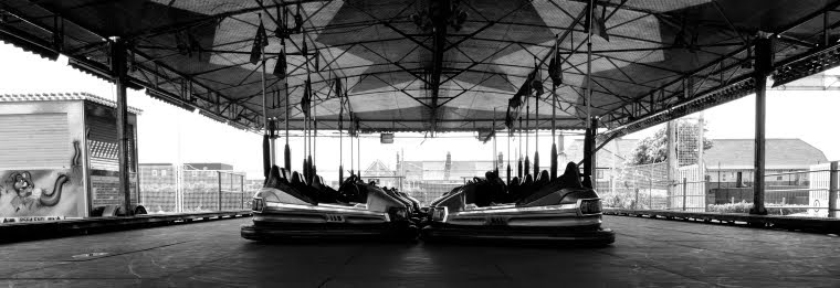
    I chose to represent two different perspectives of my local neighbourhood of Feltham in Middlesex (just outside Heathrow airport).  Feltham is an area that has enormous potential due to its strategic location, yet it is run down, under invested and generally quite rough.  I wanted to see whether I could present this perspective (which was easy) and another more uplifting, positive view (not so easy).  I found a few visual representations that with the exclusion of surrounding areas in the frame, could isolate the good, but I also had to use metaphorical representations.  The narrative I constructed was not a linear narrative (as in one event happened after another), but more of a study of place that should enable the viewer to form an opinion.  Was this objective achieved?  I think that with the help of captions of the photos that opinion could be directed, and so yes, the objective was achieved.

    Funnily enough, I realised later when I was putting the work together that I had recreated the first exercise of TAOP on contrasts!  Hopefully, my photography has improved since then!

    Did I take any risks?  To be perfectly frank, walking through Feltham with £4k worth of camera and lens is a massive risk.  On top of that I climbed walls, walked around an unsafe building (inside the barrier), stood in the road, photographed people, and stood around a weapons bin for ages.  These are all risks that as a street photographer I'm comfortable with, my equipment is insured, so I didn't really step outside my own comfort zone, although others may not have been comfortable with that.

    During the shooting itself, particularly on the second day where I had an ideas list to work through, I felt quite down about the photography.  I didn't enjoy working through a checklist that in the end I wasn't that passionate about.  I nearly gave up on this idea, but when I looked through the images, realised they were ok, and that I could crop them consistently to make a stronger collective, I decided to go with it.

    Demonstration of technical and visual skills

    I think this was probably quite average.  These were all landscape shots and my objective was to take clear sharp images that were correctly exposed, with suitable background blurring where advantageous (in B - Rescued and G - New Life).

    Quality of outcome

    I think the images have been presented well with coherent narrative.  I stuck to the same format for each image so that they look and feel as part of the same series.  I would have preferred consistent lighting throughout, but the images were taken over two different days, so I couldn't control that.  I think I have conceptualised and communicated my ideas of the two different states of the area, its inhabitants and its economy.  I think the concept of two different economies comes through quite clearly in C - Bust / Booming, D - Decaying / Developing, E - Cramped / E - Comfy, F - Deposits / Withdrawals.

    Demonstration of creativity

    Have I shown imagination?  I honestly don't know.  The depiction of the graveyard as the end of the life cycle in G - Pushing up the daisies is imaginative, from the point of view that this is shown as a negative concept.  I thought through various captions for this including not needing light, buried, asleep, end of life, and although the image in itself is lovely i.e. green, bright light, happy feel, it is in the negative set because it is supposed to convey the extinction of life (versus the conkers in G - New Life), as an extension of the idea conveyed by the weapons bin in F - Deposits.  In the end, I didn't want to offend anyone or be too morbid, so I added some humour with the popular daisy phrase.  There is also a distinct metaphorical representation of the whole concept of a neglected suburb vs one undergoing regeneration in B - Abandoned / Rescued.

    Does this work show personal voice?  I don't think it does; I'm not really at that point yet.  The street photography exercise I did in Brighton is much closer to where I think I'm heading with personal voice.  Although, this said, I can see 4-5 strands emerging, and an urban social commentary is starting to become one of them.  The images A - Confined / Open is quite similar to the work I did previously for Assignment One in DPP (at HMP The Verne, Portland).

    Context

    Aside the two authors mentioned in my Preparation and Execution post, I struggled with research and context, although this was not without trying (including asking the OCA Photography 1 Facebook group, Crossing Lines and my tutor).

    All in all, I think my work has improved since TAOP, without doubt; I am now thinking more conceptually and metaphorically than I used to.  My biggest problem with this exercise was that I didn't feel that I had a good story. 

    Saturday 27 September 2014

    Transition Photography: Balfron Tower

    A short while ago, I went to a Transition Photography exhibition of Balfron Tower, displayed inside Balfron Tower in London E14.  The exhibition was put together by some fellow members of Crossing Lines, who are interested in the changing face of the urban landscape in London.


    I had never been inside such a building before, plus I had never been to an exhibition about social housing before either, and I had never been to All Saints before, so I wasn't sure what to expect.  I knew that the photographers are very interested in architecture, social housing and regeneration, so I knew it was going to be different.  This was apparent even by the sign on the door of flat 89, which was on the 15th floor (I think...might have been 18th...).


    Well my first reaction was about the amazing photography.  I'm always blown away by photographers who are able to, quite frankly make photographs of subjects that, let's be honest, aren't beautiful, look amazing.  These four below are by Peter Luck:


    Beautiful printed, crystal sharp images, straight lines, and dramatic diagonals.  I loved the original display - photographs straight on the walls - in their natural surroundings!

    I liked all the images I saw, but particularly those by Mike Seabourne, who captured the everyday objects found left behind in the flats that had been abandoned (that he had access to).  He captured the "traces" of people and I found these photographs strangely eerie:


    Seabourne's approch to format and composition is very similar to what I previously described as "Grand Budapest Hotel" style.  These were very large prints and just wonderful.  This exactly the style of photography I'd like to perfect.

    This project about Transition is ongoing.  There may be a chance for me to participate in the new year, when I've finished with Bleeding London....

    For more information see: http://www.transition.photography/

    and: http://thelondoncolumn.com/2014/09/19/balfron-remembered/http://thelondoncolumn.com/2014/09/19/balfron-remembered/

    Assignment One - Submission - Two Sides of the Same Story

    Feltham, TW13: 28 minutes from London Waterloo, two miles from the rest of the world.  Run down, under-invested west London suburb littered with danger zones or multicultural, convenient transport hub sprouting pockets of growth? 

    Walking around, you easily get the impression that is an area in dire need of regeneration, investment and quite frankly up-scaling.  Its location is amazing - close to Central London, four major motorways, and an international airport - and surrounded by the greenery of Richmond and Surrey:


    Yet, to me it seems that Feltham is a neglected area.  Its strategic location is perfect for commuters and travelers alike, it is surrounded by thriving areas of business, yet somehow it has missed out on growth and opportunity.

    In September 2014, I set out to capture the dual personality of this London suburb in which I live; well actually, in which I sleep, eat and commute from.  I created two views of the same place: one which shows its more obvious nature of neglect, underinvestment and no future, and the other set showing a brighter and more hopeful state of being.  I compiled two sets of seven photographs accordingly, and arranged them in pairs, so that within each pair there is either a visual or metaphorical contrast, to present two sides of the same story:

    A - Confined

    A - Open

    B - Abandoned

    B - Rescued

    C - Bust

    C - Booming

    D - Decaying

    D - Developing

    E - Cramped

    E - Comfy

    F - Deposits

    F - Withdrawals

    G - Pushing up the daisies

    G - New life